
Overview
Borderlands is a an action role-playing first-person looter shooter video game franchise set in a space western science-fiction universe. The games have a dramatic comic book art style that I want to capture in my plot.
Gearbox, the developers of Borderlands, have explained that this art style is achieved using “hand-drawn textures, scanned in and coloured in Photoshop, combined with software that draws graphic novel-style outlines around characters and objects, sharpens shadows to look more like something an artist might create, and even draws lines on hills and inclines. Finally the character models are all revamped with more exaggerated proportions, creating the appearance of a detailed comic book in motion.”
Some of these are not relevant to plotting, but two are:
- Drawing graphic novel-style outlines
- Using hand-drawn textures
Theming Inspiration
The in-game menus in Borderlands 3 provide a great design reference for plot theming.
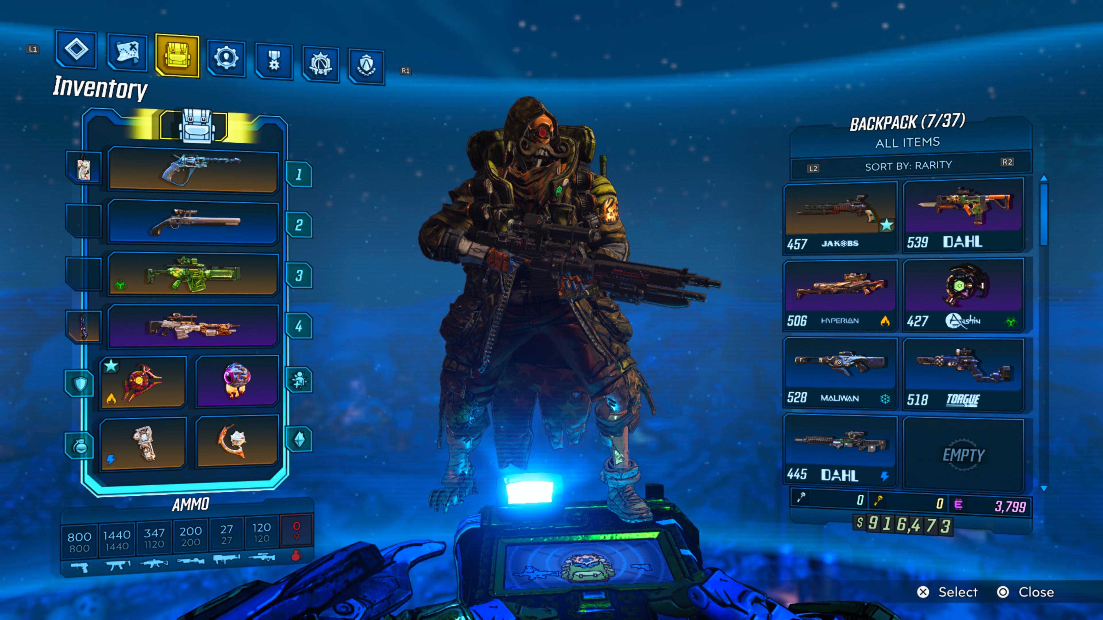
I want to translate these design elements to my plot like so:
- The Compacta Bold font can be used for plot text.
- The blue background and light blue UI highlights can be used for the plot background and axes, respectively.
- The white header text and the blue text can be used for different textual elements of the plot.
- The yellow colour can be used for the plot title (this is the colour used for the game’s titles).
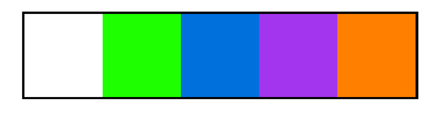
- The loot rarity colours can be used for grouping data in plot geoms.
- All elements should have a black outline.
Applying these elements to my plot will help it fit the Borderlands aesthetic.
Prerequisites
library(tidyverse)
library(glue)
library(lubridate)
library(magick)
library(ggdist)
I’ll be using Steam player data for my plot. The data contains statistics for the average and peak number of players playing a variety of games each month from July 2012 to February 2022. You can download this data with the Data Source code in the appendix, or from Tidy Tuesday with tidytuesdayR::tt_load("2021-03-16").
# Load the weekly data
games <- read_csv(here("data", "2021-03-16_games.csv"))
games
Wrangle
I only want data from the mainline Borderlands titles for my plot, so let’s get those.
# Filter to mainline Borderlands titles available in the data. The first game
# is not available in the dataset so filtering based on the title and digit
# works fine here.
borderlands <- games %>%
  filter(str_detect(gamename, "Borderlands[[:space:]][[:digit:]]"))

borderlands
Now to explore the data.
# Summarize how much data exists for each Borderlands title
borderlands %>%
  group_by(gamename) %>%
  summarise(count = n())
Borderlands 2 was released on Steam in September 2012 and Borderlands 3 was released in March 2020, which explains the discrepancy in how much data exists between the two. One way to make them more comparable is to filter the Borderlands 2 data down to only its first year of release.
# Wrangle date data into a date-time object to prepare for filtering
borderlands <- borderlands %>%
  mutate(date = glue("{year}-{month}"),
         date = parse_date_time(date, "ym"),
         .after = gamename)

# Filter Borderlands 2 data down to only its first year of release to make
# comparisons with Borderlands 3 more appropriate. There is no need to filter
# by date for Borderlands 3 since only its first year of data are available in
# the dataset.
borderlands <- borderlands %>%
  filter(gamename == "Borderlands 2" &
         date %within% interval(ymd("2012--09-01"), ymd("2013--08-01")) |
         gamename == "Borderlands 3")

borderlands
Now there is monthly data for the first year of release for each game. I want to compare how the two games performed against each other in their first year. This will give some insight on how the player stats changed over time within and between the games. Creating a new variable counting the number of months since release is a clean way to do this. I could also stick with nominal months, but using a count variable will make the comparison between the games more apparent in my plot.
# This code is sufficient since the data is in reverse chronological order.
borderlands <- borderlands %>%
  group_by(gamename) %>%
  mutate(since_release = 11:0, .after = month)

borderlands
Finally, I need to decide how to relate the five rarity colours from Figure @ref(fig:loot-rarity) to the player stats for the first year of release for each game. Since there are five levels, cutoffs based on quantiles could work.
borderlands %>%
  summarise(quantile = quantile(peak))
Rather than following the quantiles exactly, I’ve picked some cutoffs that look like they would work well for both games. An alternative approach would be to assign cutoffs per game, in which case the exact quantiles could be used.
borderlands <- borderlands %>%
  mutate(rarity = case_when(
    between(peak, 0, 19999) ~ "white",
    between(peak, 20000, 39999) ~ "green",
    between(peak, 40000, 59999) ~ "blue",
    between(peak, 60000, 79999) ~ "purple",
    between(peak, 80000, 150000) ~ "orange"
  ))
Visualize
There are two obvious ways to visualize this data: A time series line graph, or a bar graph. I’m going to use a bar graph, mainly so I can group the bars using the loot rarity colours I mentioned earlier. A line graph would be a better choice for communication though.
The ggplot2 package doesn’t support outlines for the plot elements such as titles, axis lines, or strips—only some plot geoms support outlines. Because of this, I need to create two plots: An outline plot, and a coloured plot. Then I can combine the two plots with the magick package to create the outline effect.
The outline plot will look like this. Nothing too exciting.
outline_plot <- ggplot(borderlands, aes(since_release, peak)) +
  facet_wrap(vars(gamename)) +
  labs(
    x = "Months Since Release",
    y = "Peak Player Count",
    title = "Peak players in Borderlands drop faster\nthan common loot",
    caption = "Source: Steam / Graphic: Michael McCarthy"
  ) +
  theme_bw() +
  theme(
    text = element_text(family = "Compacta Bold", colour = "black"),
    axis.text = element_text(colour = "black"),
    axis.line = element_blank(),
    panel.grid.major = element_blank(),
    panel.grid.minor = element_blank(),
    panel.border = element_rect(colour = "black", fill = NA),
    strip.background = element_rect(fill = "white", colour = "black")
  )

outline_plot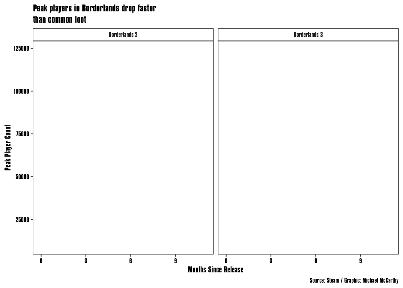
The coloured plot is the same thing… but with colour. I’m adding a pink background here so the white text is visible, and so there is a distinct colour I can detect to make the background transparent later.
blue <- "#08283c"
light_blue <- "#115190"
baby_blue <- "#a7e5ff"
indigo <- "#cef8ff"

colour_plot <- outline_plot +
  theme(
    text = element_text(colour = "white"),
    # Axis
    axis.text = element_text(colour = indigo),
    axis.ticks = element_line(colour = light_blue),
    # Panel
    panel.grid.major.y = element_line(colour = light_blue),
    panel.grid.minor.y = element_line(colour = light_blue),
    panel.border = element_rect(colour = light_blue, fill = NA),
    panel.background = element_rect(fill = blue, colour = light_blue),
    # Plot
    plot.title = element_text(colour = "#fff01a"),
    plot.background = element_rect(fill = "pink"),
    # Strip
    strip.text = element_text(colour = baby_blue),
    strip.background = element_rect(fill = "#00378f", colour = light_blue)
  )

colour_plot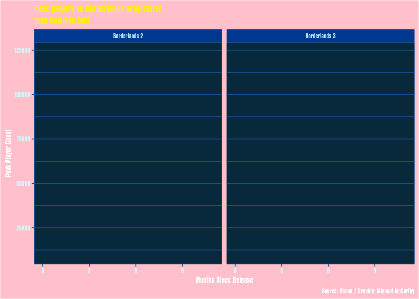
Now for some image magic! First I need to turn the outline ggplot into an image to prepare for post-processing. I’ll save the image to a temporary file since it’s only an intermediate step. Note here that the image is really big, and I’ve scaled up the sizes of plot elements accordingly; this is needed to make the outlines look good, since the post-processing involves detecting the edges of elements.
# Create plot used for the outline
file <- tempfile(fileext = '.png')
ragg::agg_png(file, width = 1920, height = 1200, res = 300, units = "px", scaling = 0.5)
outline_plot +
  geom_col(fill = "white") +
  stat_ccdfinterval(fill = "white", point_alpha = 0) +
  theme(
    # Axis
    axis.title = element_text(size = 36),
    axis.text = element_text(size = 28),
    axis.text.x = element_text(margin = margin(5, 0, 5, 0, "pt")),
    axis.text.y = element_text(margin = margin(0, 5, 0, 5, "pt")),
    axis.line = element_line(size = 0),
    axis.ticks = element_line(size = 2),
    axis.ticks.length = unit(10, "pt"),
    # Panel
    panel.border = element_rect(size = 0),
    panel.background = element_rect(colour = "black", size = 5),
    panel.spacing = unit(3, "lines"),
    # Plot
    plot.title = element_text(size = 56),
    plot.margin = unit(c(40, 40, 40, 40), "pt"),
    # Strip
    strip.text = element_text(size = 36, margin = margin(0.5,0,0.5,0, "cm")),
    strip.background = element_rect(size = 5),
    # Caption
    plot.caption = element_text(size = 24)
  )
invisible(dev.off())
For the actual post-processing, I detect the edges of all the plot elements, then dilate them outwards. Finally the white areas in the plot are made transparent, so all that’s left is the black outlines. To demonstrate, I’ve created a blank white image here and flattened the outline plot on top of it.
plot_outline_layer <- image_read(file) %>%
  image_convert(type="Grayscale") %>%
  image_negate() %>%
  image_threshold("white", "5%") %>%
  image_morphology('EdgeOut', "Diamond", iterations = 6) %>%
  image_morphology('Dilate', "Diamond", iterations = 1) %>%
  image_negate() %>%
  image_transparent("white", fuzz = 7)

image_flatten(c(image_blank(1920, 1200, color = "white"), plot_outline_layer))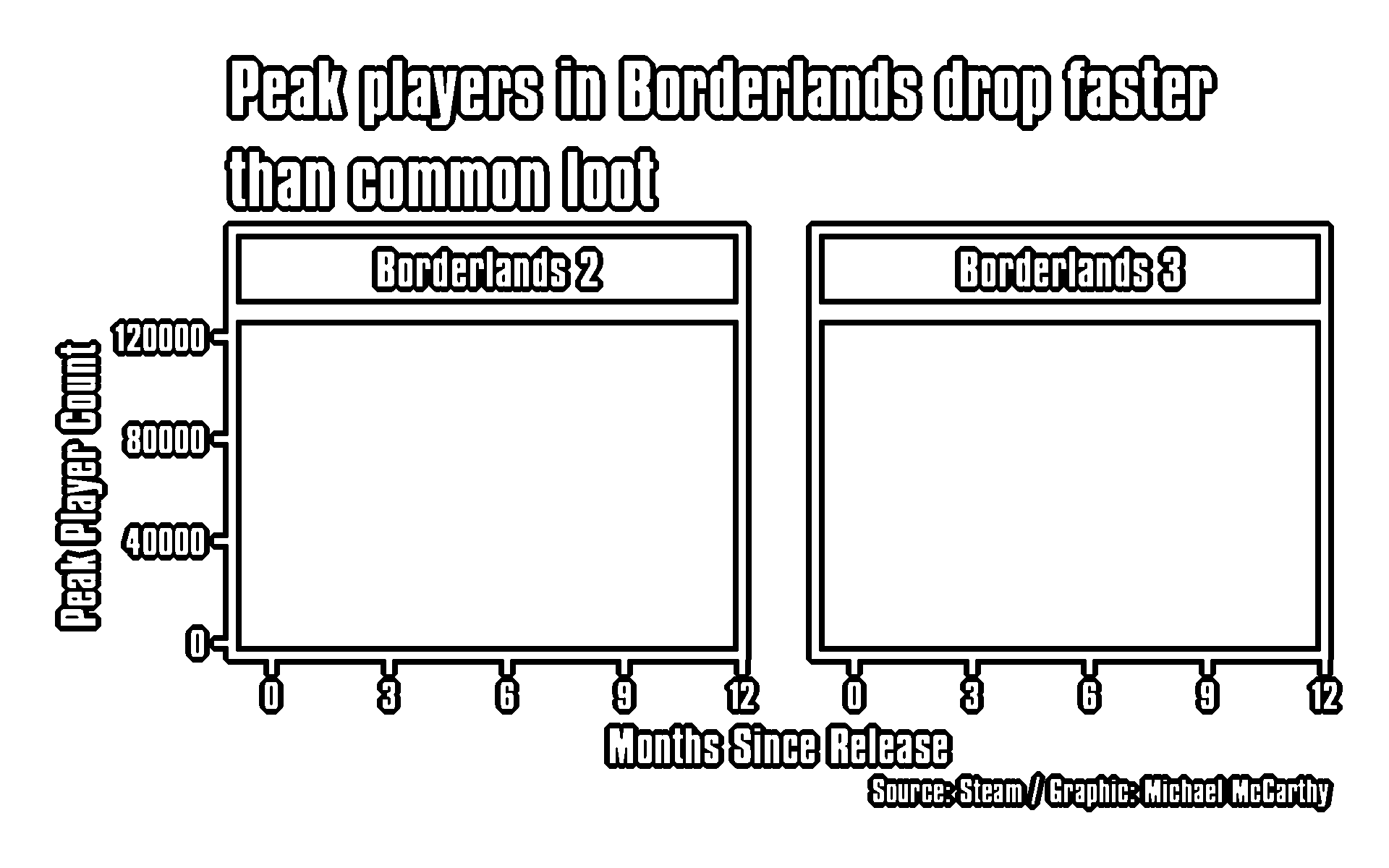
Next the colour plot, which just needs to be scaled up with the bars added to it, then saved to a temporary file. Here I’ve used CCDF bars with a gradient, courtesy of the ggdist package, going from black to colour to match the gradients in the ECHO-3 in-game menu in Borderlands 3. It’s a bit tacky, and there isn’t an easy way to add gradients to any other plot elements, but it fits the theme.
file <- tempfile(fileext = '.png')
ragg::agg_png(file, width = 1920, height = 1200, res = 300, units = "px", scaling = 0.5)
colour_plot +
  # First a solid fill column
  geom_col(aes(fill = rarity)) +
  # Then use a ccdfinterval to create a vertical gradient over top the solid
  # fill
  stat_ccdfinterval(
    aes(fill = rarity, fill_ramp = stat(y)),
    fill_type = "gradient",
    show.legend = FALSE,
    point_alpha = 0
  ) +
  scale_fill_identity() +
  scale_fill_ramp_continuous(
    from = "black",
    range = c(0.8, 1),
    limits = c(0, 15000)
  ) +
  expand_limits(y = 0) +
  # Finally add a black outline over top of everything
  geom_col(fill = NA, colour = "black", size = 1) +
  theme(
    # Axis
    axis.title = element_text(size = 36),
    axis.text = element_text(size = 28),
    axis.text.x = element_text(margin = margin(5, 0, 5, 0, "pt")),
    axis.text.y = element_text(margin = margin(0, 5, 0, 5, "pt")),
    axis.line = element_line(size = 0),
    axis.ticks = element_line(size = 2),
    axis.ticks.length = unit(10, "pt"),
    # Panel
    panel.border = element_rect(size = 0),
    panel.background = element_rect(size = 5),
    panel.spacing = unit(3, "lines"),
    # Plot
    plot.title = element_text(size = 56),
    plot.margin = unit(c(40, 40, 40, 40), "pt"),
    plot.background = element_rect(fill = "pink"),
    # Strip
    strip.text = element_text(size = 36, margin = margin(0.5,0,0.5,0, "cm")),
    strip.background = element_rect(size = 5),
    # Caption
    plot.caption = element_text(size = 24)
  )
invisible(dev.off())

plot_fill_layer <- image_read(file)

plot_fill_layer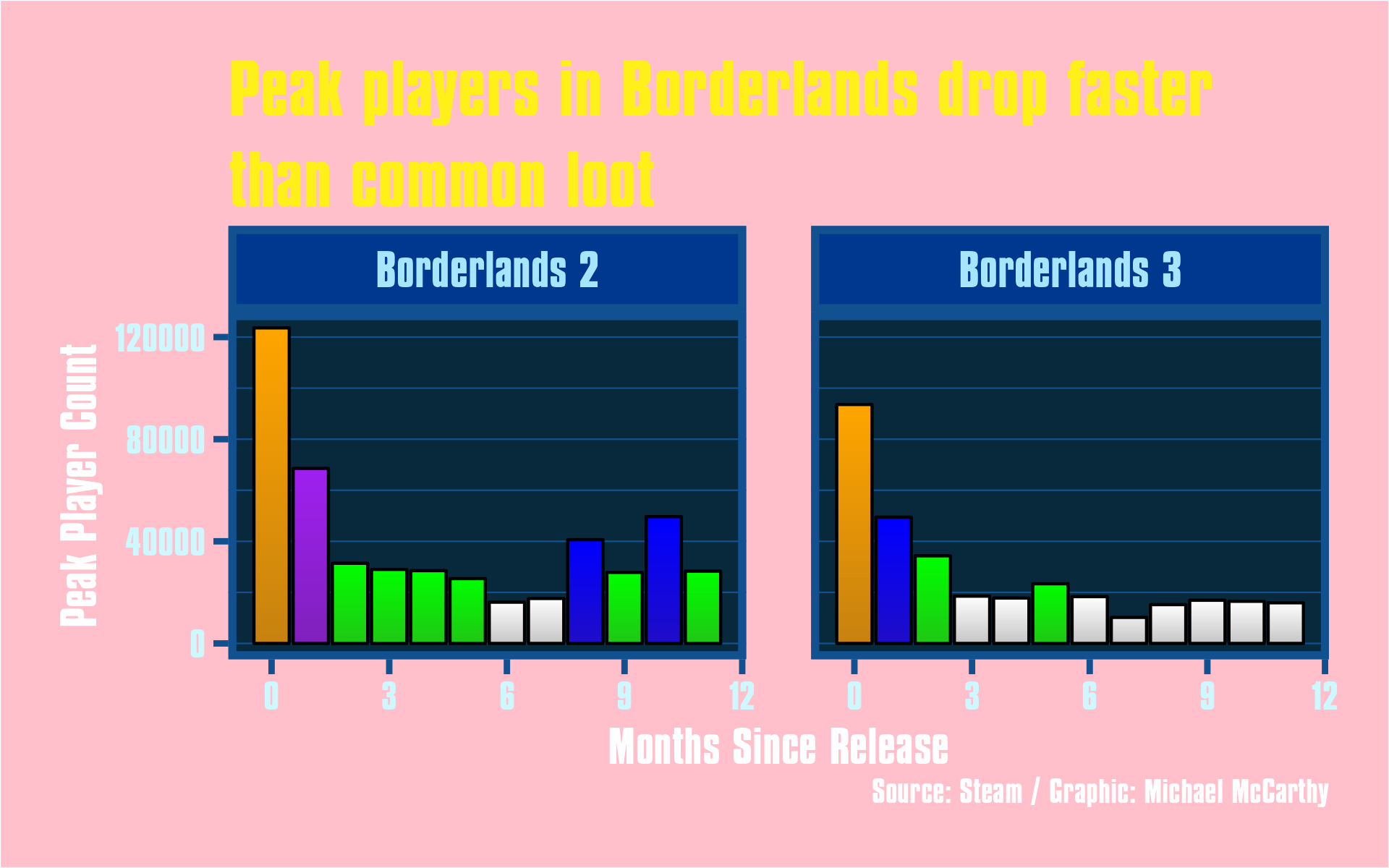
Finally, the outline and fill layers can be combined, and the background made transparent. I think the outline effect is actually pretty convincing.
plot_layer <- image_composite(plot_fill_layer, plot_outline_layer) %>%
  image_transparent("pink", fuzz = 7)

plot_layer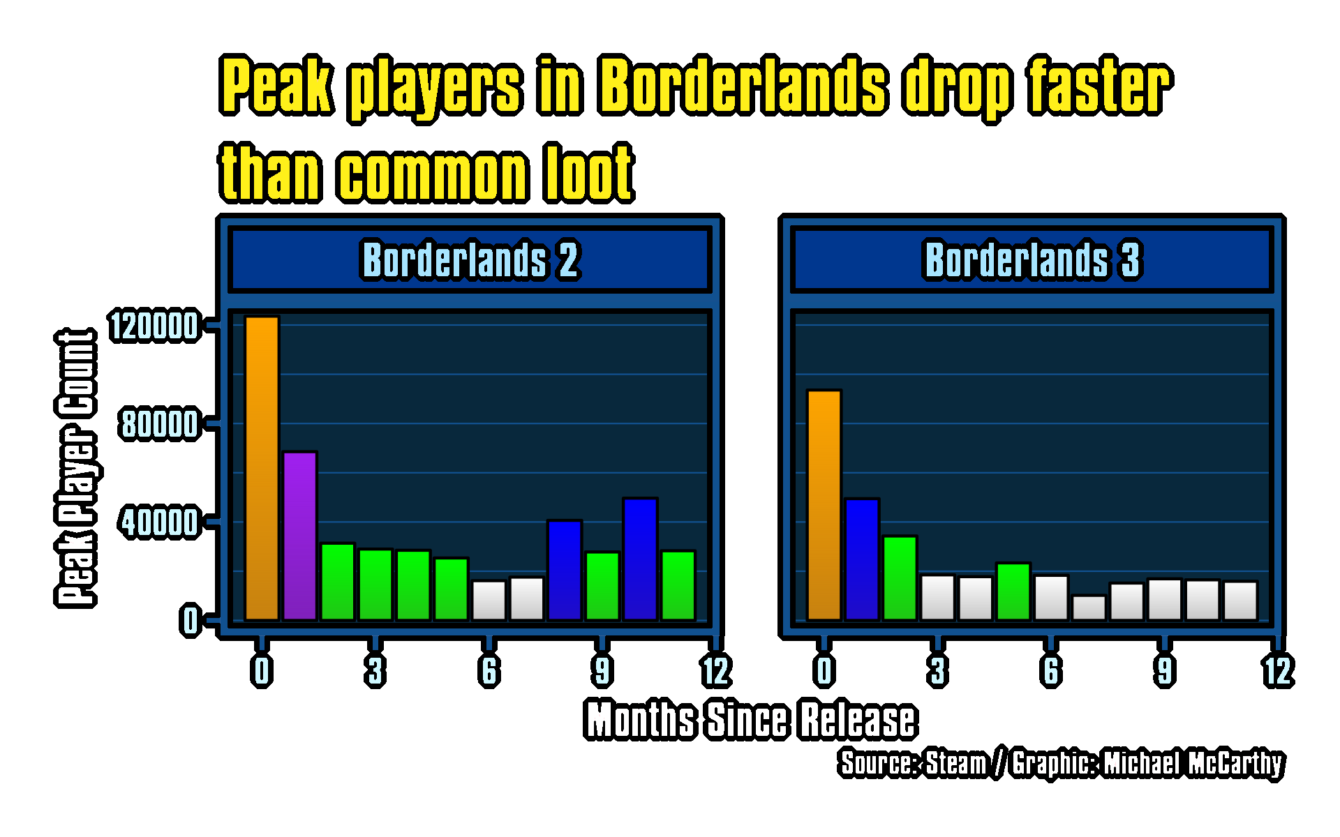
And the background image can be added for the final composite. To make it stand out less, I’ve overlaid a solid black frame with 50% opacity.
background_layer <- image_read(
  here("posts", "2022-09-29_borderlands", "images", "plot-background.png")
) %>%
  image_colorize(50, "black")

final_graphic <- image_composite(background_layer, plot_layer)
This plot isn’t going to win any awards (unless it’s for an ugly plots contest), but it does show that you can do some pretty cool programmatic image processing of your plots (or any other images) with the magick package.
Final Graphic
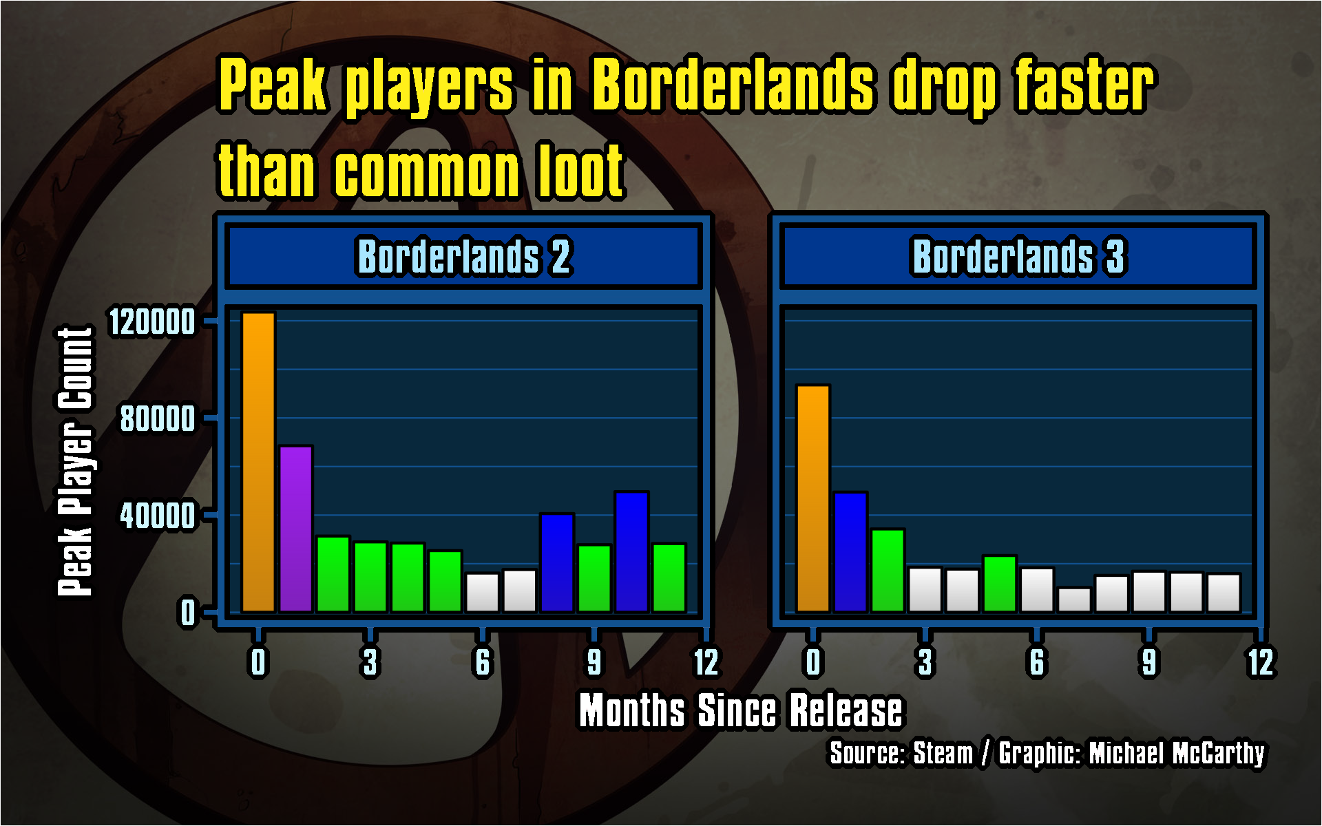
![]()
Michael McCarthy
Thanks for reading! I’m Michael, the voice behind Tidy Tales. I am an award winning data scientist and R programmer with the skills and experience to help you solve the problems you care about. You can learn more about me, my consulting services, and my other projects on my personal website.
Session Info
─ Session info ───────────────────────────────────────────────────────────────
 setting  value
 version  R version 4.2.2 (2022-10-31)
 os       macOS Mojave 10.14.6
 system   x86_64, darwin17.0
 ui       X11
 language (EN)
 collate  en_CA.UTF-8
 ctype    en_CA.UTF-8
 tz       America/Vancouver
 date     2022-12-21
 pandoc   2.14.0.3 @ /Applications/RStudio.app/Contents/MacOS/pandoc/ (via rmarkdown)
 quarto   1.2.280 @ /usr/local/bin/quarto

─ Packages ───────────────────────────────────────────────────────────────────
 package     * version date (UTC) lib source
 dplyr       * 1.0.10  2022-09-01 [1] CRAN (R 4.2.0)
 forcats     * 0.5.2   2022-08-19 [1] CRAN (R 4.2.0)
 ggdist      * 3.2.0   2022-07-19 [1] CRAN (R 4.2.0)
 ggplot2     * 3.4.0   2022-11-04 [1] CRAN (R 4.2.0)
 glue        * 1.6.2   2022-02-24 [1] CRAN (R 4.2.0)
 here        * 1.0.1   2020-12-13 [1] CRAN (R 4.2.0)
 lubridate   * 1.9.0   2022-11-06 [1] CRAN (R 4.2.0)
 magick      * 2.7.3   2021-08-18 [1] CRAN (R 4.2.0)
 purrr       * 0.3.5   2022-10-06 [1] CRAN (R 4.2.0)
 readr       * 2.1.3   2022-10-01 [1] CRAN (R 4.2.0)
 sessioninfo * 1.2.2   2021-12-06 [1] CRAN (R 4.2.0)
 stringr     * 1.5.0   2022-12-02 [1] CRAN (R 4.2.0)
 tibble      * 3.1.8   2022-07-22 [1] CRAN (R 4.2.0)
 tidyr       * 1.2.1   2022-09-08 [1] CRAN (R 4.2.0)
 tidyverse   * 1.3.2   2022-07-18 [1] CRAN (R 4.2.0)
 timechange  * 0.1.1   2022-11-04 [1] CRAN (R 4.2.0)

 [1] /Users/Michael/Library/R/x86_64/4.2/library/__tidytales
 [2] /Library/Frameworks/R.framework/Versions/4.2/Resources/library

──────────────────────────────────────────────────────────────────────────────
Data
Download the data used in this post.
Fair Dealing
Any of the trademarks, service marks, collective marks, design rights or similar rights that are mentioned, used, or cited in this article are the property of their respective owners. They are used here as fair dealing for the purpose of education in accordance with section 29 of the Copyright Act and do not infringe copyright.
Citation
BibTeX citation:
@online{mccarthy2022,
  author = {Michael McCarthy},
  title = {Tales from the {Borderlands}},
  date = {2022-09-29},
  url = {https://tidytales.ca/posts/2022-09-29_borderlands},
  langid = {en}
}
For attribution, please cite this work as:
Michael McCarthy. (2022, September 29). Tales from the
Borderlands. https://tidytales.ca/posts/2022-09-29_borderlands
Comments